
Employer
Yahoo — Central Tech
Role
Lead Product Designer
Sector
Technology
Discipline
Product design
Timeframe
2017 — 2021
Team
Jay, Design Manager
Jazmin, Product Designer
Marco, Product Designer
Overview
Context
When Denali was founded my team consisted of myself and two other designers led by our manager. We were the very first design team to join Yahoo’s Central Tech organization which meant we had the enormous responsibility of introducing design-centered practices, thinking, and processes to a suite of 15 or so developer platforms for the very first time.
Goal
With such a small team supporting so many products we needed to develop a solution to support them all. Our solution was to build a design system that would allow product teams to streamline their process.
Role
My main role was to lead the Denali team to success, but with such a small team I wore many hats during this time. Some include product designer, developer, scrum master, marketer, content designer, editor in chief, design advocate, the list goes on.
The Challenge
Inconsistent UI/UX
UI and UX patterns were inconsistent from product to product resulting in a poor user experience.
Engineering silos
Platform teams did not cross collaborate with each other. This meant custom frameworks were being built from scratch for every product.
Source of truth
Sense development was in silos this meant every team had their own source of truth.
The Vision
Identify
Identify the problem and gaps where our design team could provide insights and assist product and engineering teams.
Build
Create a design system comprising a component library, CSS framework, and rules for implementation. These features were key to meeting our needs and the needs of our engineers.
Publish
Everything we created needed to be available so that everyone at Yahoo could benefit from it. Again we were looking to establish a company wide impact, so we wanted our work to have that visibility and accessibility.
Process overview
Everyone has a grasp on the design process, so I don’t need to explain it. However I want to mention my personal beliefs about the design process and how I see it as a guide. I don’t believe every project requires you to go through each step, but instead tailor these steps to the project you are working on.
Understand
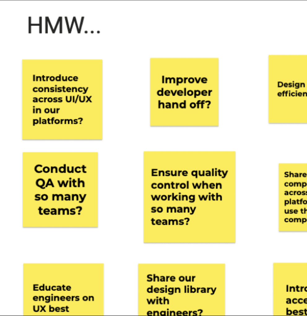
How might we
Introduce consistency across platforms?
Improve dev hand off?
Design more efficiently?
User interviews
Platform teams did not cross collaborate with each other. This meant custom frameworks were being built from scratch for every product.
Usability audits
Existing developer platforms
Existing frameworks
Define
Design libraries
If we built a Design library it would make our design process faster, and improve the end user experience by bring consistency to the developer platform suite.

Developer frameworks
By building CSS and React frameworks, this would streamline developer hand off as components would map one to one.

Rules for implementation
We’d need to establish one source of truth that designers and engineers could draw from.
Design
Primitives
We started with the design basics and established a type and color system. We knew these would be the foundation to all our designs and components moving forward to so we built them to be expandable.
Later on we established “helpers” these were design tokens that assigned values to our naming convention. These effectively made it easier for sizing, spacing, color, border radius, virtually any properties.

Expandable color system

Typography system

Design tokens = Developer variables
Components
After auditing the central tech internal product and reviewing our competitors we create a list of 25 components, which would give us a component coverage of 80%. This was an ideal number as it gave our users a great toolbox to build products.
While creating our design libraries we wanted to make sure that our variants or component props were easy to use and understand. This would be crucial later down the line when we would start to develop these.

Figma component props

Alert components - Notification, Banner, Block level

Segment controller
Icons
In order to maintain visual consistency between icons we developed our icon grid. The icon grid is 48 by 48 pixels wide and consists of a 46 by 46 pixel live area surrounded by a 2 pixel border of padding on each side. Contained within the grid are various key line shapes. Designing within the bounds of these shapes ensures visual consistency and balance between icons.

Icon grid examples

Adobe XD plugin
Implementation
Components
All our components needed to exist in design libraries and code. As we started to build the components we wanted to create the same user experience we did with our design libraries. Our first step was creating a CSS framework that was a one to one mapping of the design props to the CSS classes. This made it easy for developers to inspect a design and know which classes to add.
Later we added React and Ember frameworks that utilized the same taxonomy as they were built on top of the CSS framework.

Alerts notification component with the corresponding code in HTML and CSS.

Alerts notification component with the corresponding code in React.
Icons
With our icon library growing rapidly to well over 1000 icons, we needed to effectively provide updates to developers across all the different platforms we supported. We ended up building a package that included SVG files, SVG sprite, font, and JS library.

Bug icon with the corresponding code.
Document
Develop
Since developers were our primary users we wanted the develop page to appear as the first tab. We included resources for the different frameworks we offered, CSS, React, and Ember. Additionally, we had demos and wrote guides on how to utilize Denali from a dev stand point and methods for collaborating with our design team.
Within these pages we utilized Storybook, a frontend workshop for building UI components in isolation. This allowed us to provide a GUI that allowed engineers to customize components and copy code directly to their app or site.

Components
Our components pages housed all information to a specific component. We included developer docs, foundations, component types, placement principals, and theming options. These pages became invaluable to our engineers and designers who later onboarded to our team.

Design
The design pages were built last, but looking back we should have built these first. Probably the most underrated pages, they allowed our team to 3x our support across the Central Tech org. These were primarily made to assist engineers in learning a little more about our design principles.
We had to grow Denali to support products with no design teams at all and I believe this was due to our extensive documentation and principles allowing users the ability to turn to Denali to answer questions related to the UI.

Success Metrics
Satisfaction
80% Improvement in engineer and designer collaboration, resulting in fewer iterations during handovers
Efficiency
75% Efficiency increase with a notable drop in bug reports, attributed to concise documentation that ensures consistency
Source of truth
2x Decrease in time spent building and developing components by defining a structured process.
Reflection & key learnings
Given that we were a small team I had to wear many hats and gained countless news skills, like learning new front-end dev languages. My main takeaway was learning how to make a design team run efficiently all while meeting business goals. Lastly, I learned how to influence leadership to push initiatives. Getting buy-in for Denali was not easy.